


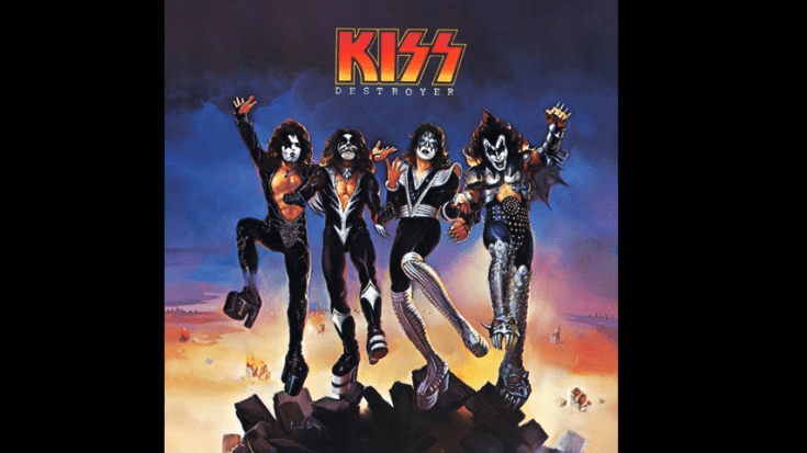
The Story Of How The Original KISS Logo Was Created
via KISS/YouTube
Paul Stanley shared a heartfelt moment on social media recently. He posted a picture of a flyer he drew by hand 50 years ago for a Kiss club show’s anniversary.
In the post, he mentioned:
“Fifty years ago, I hand drew the poster on the left for our Aug. 10 show at the Hotel Diplomat.”
He also pointed out another poster done by Ace Frehley for a show at the Coventry club three weeks later. Stanley expressed his pride in the fact that the logo he created for that day remains unchanged and iconic. This gesture was a touching tribute to Kiss’ early years, back when they were still building their reputation before becoming one of the most famous rock bands ever.
The Original Logo Designer
The original members of Kiss, including Stanley, Frehley, Gene Simmons, and Peter Criss, have all acknowledged Frehley as the one who initially came up with the idea for the original Kiss logo. They recount this in various books. The general agreement is that Frehley sketched the first version, while Stanley later refined and perfected it.
In the biography of the band titled Kiss: Behind the Mask, Simmons recalled that Frehley designed the Kiss logo before the band’s debut show at the Coventry (formerly the Popcorn Pub) on January 30, 1973. Simmons mentioned that they were distributing leaflets for the show and had a picture that made them resemble the Sons of the Dolls.
Frehley’s friend blew up the picture into a larger size, and Simmons suggested to Frehley that they needed to put the group’s name on it in a fancier way. Frehley then created the logo that we now recognize as Kiss’ iconic symbol. Frehley also shared that he designed the logo right after the band decided to change their name from Wicked Lester. He recalled:
“The week we decided to call ourselves Kiss, I went home and made a button. I created a logo on it, and the only difference between that button and the logo as it is today is that I had a dot on the ‘i’ like a diamond. Despite what people say, I wasn’t thinking of the [Nazi] SS when I designed it. I was thinking more of lightning bolts. In fact, my first boots had lightning bolts down the side.”
Frehley acknowledged Stanley’s involvement in refining the logo in his memoir, No Regrets. He mentioned that designing the logo, which has become one of the most recognizable in rock history, wasn’t very challenging, and that everyone loved it. Stanley, who had artistic training, polished the design to make it neat and precise. Criss then supported this version of events in his autobiography, Makeup to Breakup. He explained:
“When Ace came in a week later with his sketch for a Kiss logo, the name was confirmed in heaven.”
Criss praised Frehley’s artistic abilities and described the logo, with lightning bolts as the last two letters, as fantastic. Stanley further refined the logo, straightening the ‘K’ a bit, and thus, the name and logo were established. While Stanley himself credited Frehley for the original concept of the Kiss logo in his memoir, Face the Music. He recalled:
“Ace had jotted down a logo for the flyer for our Bleecker Street Loft shows.”
Stanley, who considered Frehley a decent artist, used his sketch as a starting point for designing a series of Kiss logos. After some iterations, they arrived at the logo that has become synonymous with Kiss for the past four decades.
However, even Stanley’s final version had some imperfections. He vividly remembered creating the definitive version on the thick white stock using a straightedge and drafting pen while sitting on his parents’ sofa. He admitted:
“The SS in the logo actually consists of one S that is thicker than the other, with different proportions, and they aren’t exactly parallel — because I just eyeballed it. Ace’s concept was closer to the Nazi SS.”
Banned in Germany
No matter what the band’s members intended, the SS Bolts, the symbol of the paramilitary Schutzstaffel of the Nazi Party, were viewed as having a striking resemblance to the Kiss logo. Stanley realized the symbol was prohibited in Germany, which he learned the hard way.
Stanley shared his perspective, mentioning, “Considering my Jewish background, I was particularly sensitive about the SS symbol, and Simmons’ family had survived the Holocaust.” He explained further in his book:
“Even though my father never liked our logo because he thought my version was still too close to the Nazi lightning bolts, but for me, it didn’t hit home until years later, when I learned our logo was banned in Germany because Nazi imagery was illegal there. When I drafted the logo, I certainly never intended to court controversy at the expense of victims of history. I didn’t want that on my conscience.”
Up to the present day, Kiss merchandise has a different appearance in Germany, with the lightning bolt-shaped letters being altered to straight horizontal lines.


