


6 Classic Movie Posters That Were Terrible
via Monster Movie Fun Time Go / YouTube
Movie posters are supposed to grab attention and entice audiences, but not all succeed. Some films, even great ones, were saddled with posters that missed the mark. Whether due to bad design or confusing imagery, these posters are remembered for the wrong reasons.
1. “Star Wars” (1977)
The original Star Wars poster is now iconic, but its artwork was oddly proportioned and lacked the energy of the movie. Luke Skywalker was depicted shirtless and overly muscular, which didn’t match his on-screen character.
Leia’s pose and the flashy backdrop also confused audiences, making the film look more like a pulp novel. Despite its flaws, the movie’s success overshadowed the awkward artwork.
2. “The Shining” (1980)
While The Shining is a horror classic, its poster failed to reflect its eerie tone. The design featured blocky yellow text and a peculiar drawing of a face that didn’t relate to the movie’s terrifying imagery.
Many viewers found it underwhelming and even misleading. Thankfully, the film’s reputation wasn’t hurt by this design misstep.
3. “Superman: The Movie” (1978)
The poster for Superman: The Movie was minimal, featuring only a streak of light and the famous “S” logo. While stylish, it left audiences wondering what the movie was about, offering no glimpse of its action or characters.
This lack of information was bold but also alienating. Fans were left craving a clearer connection to the hero they loved.
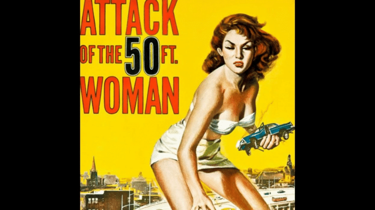
4. “Attack of the 50 Foot Woman” (1958)
This cult classic’s poster showed an exaggerated image of a giant woman wreaking havoc on a city, but the proportions and chaos were laughably off. It felt cartoonish, making it hard to take the movie seriously.
While it became a kitschy favorite, the design overshadowed the film’s plot, which had more depth than the poster suggested.
5. “Jaws 2” (1978)
The Jaws 2 poster tried to recreate the fear of the original but ended up looking forced. It featured a massive shark and a water skier in peril, yet the dramatic imagery felt more exaggerated than frightening.
Fans of the original criticized the poster’s lack of subtlety, which didn’t match the tense atmosphere of the movie.
6. “Barbarella” (1968)
Barbarella’s poster attempted to showcase the film’s sci-fi elements and lead actress Jane Fonda, but the cluttered design overwhelmed the viewer. It looked more like a chaotic comic book than a polished movie poster.
The mix of vibrant colors and awkward poses failed to capture the story’s quirky charm. The movie’s campy appeal survived despite the poor poster.


